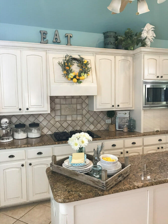
Hello my beautiful friends. I’m excited to have another informative post for you. This time it’s Wow Me On The Weekend – Decorating Above Cabinets! This always gets a few questions so hopefully after today you can find the answers you’ve been looking for. If not, ask again in the comments so I can help. Before we begin, I want to start off saying these suggestions work for those empty spaces above the kitchen cabinets as well as stand alone pieces like a hutch or entertainment unit. Okie doke, let’s get started.
Wow Me On The Weekend – Decorating Above Cabinets
 Passports and Penne
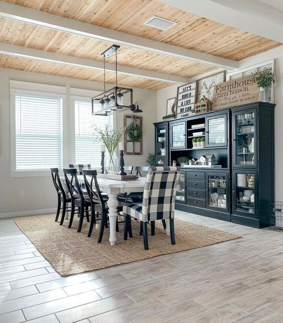
Our first example is from Passports and Penne. The layered look is popular as well as classic. Why it looks so good is because all of the pieces have common coloring and most of them are large. If this large cabinet had small pieces, it wouldn’t be so impressive. I also like that there are two large signs. With signs in a group like this, the words can look busy and be distracting. With two signs, you look from left to right and see everything in between and on the edges.
 Better Homes and Gardens via The Casa Collective
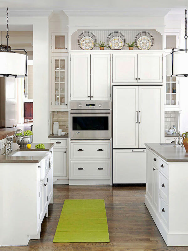
I like a clean look and this one is nice because it has symmetry. It looks uncluttered, the items are spaced out evenly, it has the uneven height thing going on and the items fill the space without overwhelming it. And the small plants in between bring out the green and yellow in the plates. If the dark wire pieces (I think they are chargers) were not standing behind the plates, the items would be to small. So if you’re the type of person that needs a balanced, even space, here it is in all it’s glory. You could also use baskets, vases, or even pictures if you’d. It doesn’t matter what it is as long as the large items are exactly the same and the smaller items are too.
 Vintage Home Designs
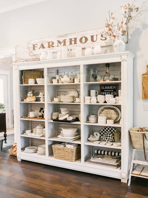
You know I love farmhouse decor so this one caught my eye right away. On top of this cabinet Michele from Vintage Home Designs adds more of her collection of ironstone on the top of the cabinet and a large sign for a casual but uncluttered look. The items on top mimic what is on the shelves so it extends the height so to speak. The added wheat colored stems on each end bring warmth and make the word Farmhouse stand out. Something I want to point out is that I don’t think greenery would look nice in place of the stems. All you would see is the greenery. In order for greenery to work, you need to use it with darker colors and/or have other greens on the shelves of the cabinet. That is unless you want the greenery to stand out. Makes sense?
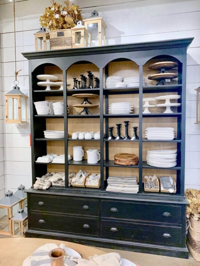 Magnolia Home
Don’t pay attention to the lantern hanging on the side of the cabinet, it will throw you off. Instead, notice the themed grouping on the left side. What makes this look good is the colors of the lanterns bring out the back wall inside the cabinet and work together with the basket and leaves. And it doesn’t distract from what’s being displayed inside the cabinet. Bunching the decor together with no empty spaces in between is a great way to showcase what’s on the shelves.
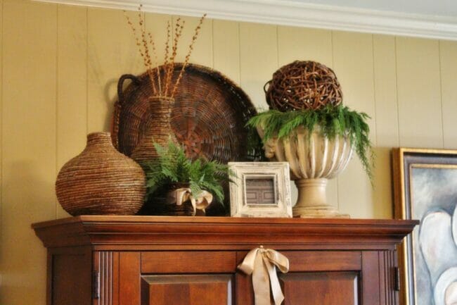 Radio Butler’s
I think the top of this cabinet from Radio Butler’s home tour looks well put together. If you like traditional style, this is for you. There’s a lot of texture and texture often times makes you stop and stare. The added greenery and varied height makes it interesting. If she wouldn’t have put the ball on top of the cream colored urn, the urn would look out of place and stand out all by itself. You don’t want that. You want everything to work together and blend.
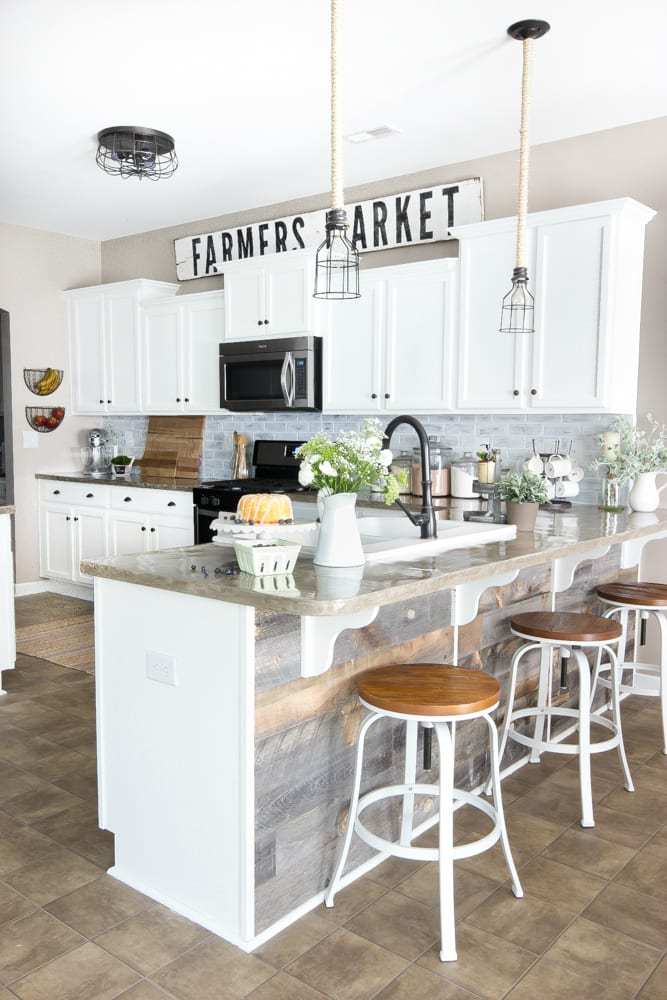 Bless’er House
Bonus! I know I said we’d have 5 photos each time but I didn’t want to leave out the people that don’t like a bunch of stuff above the cabinets but may want a little something. This one from Lauren at Bless’er House with its single large sign shows us that we don’t have to have a ton of stuff to make a big impact. It’s clean, simple and says I’m here and I’m taking charge and won’t collect as much dust! Now if that’s not a bonus, I don’t know what is. 😉 Oh yeah, if you are contemplating what to do with a small sized cabinet, you can use this idea too or maybe just add one basket with flowers or one painting. There are lots of choices for all the single lovers out there.
My wow isn’t your wow so make it your own.
Let’s recap this Wow Me On The Weekend – Decorating Above The Cabinets. If you like things above your cabinets, have a theme, keep the colors similar. Don’t get stuck on certain styles and the items can be centered or be on one side if your cabinet is long. You can use one item or a cluster. Just play around with it until you are satisfied. If you’re confused, let me know in the comments so I can clarify.
One more thing. If you have a really long span of cabinets, add an odd number of things to the corners and see how you like it. Remember to look back at these other suggestions and if you still feel it looks empty, add another grouping or one large item to the middle. And don’t forget to utilize the wall space. Hanging things on the back wall is fun. 😉
If you want to check out the first 2 posts in this series, click on the links below.
Wow Me On The Weekend – Coffee Stations!
Wow Me On The Weekend – Console Tables!

Each one is beautiful and inspirational!!
Author
Thanks so much Cheryl. Hope you have a great weekend!
What great ideas and wonderful picture examples.
Author
Thanks so much. I am hoping it helps!
My very favorite here is the Passport and Penne. That just has a huge expression! I have to say though that I am in love with what Ana from Fiddle Leaf Interiors has done with the above of her kitchen cabinets. I’ve wanted to do this for a very long time but I hadn’t seen it until I stumbled across hers. Check it out!
Author
Are you talking about her cubbies? Those seem so handy and it’s nice that the extra storage can actually be cute too! I LOVED Passport and Penne too. I need a cabinet like that! 🙂
Very informative! It gave me some ideas. Thanks! 😊
Author
Yay Karen! So glad to hear that!
Another great post. Now I will be looking ‘up’ to see what can be styled. One for sure is the top of my TV cabinet.
*Smiles*
Author
I’m amazed how people just forget about the space above small or stand alone cabinets. 😉 I’m always looking at every horizontal surface. But that’s just me.
When I moved into my apartment and discovered that all the soffits were open, I was thrilled. My collection is a tad busy, but I like it. All copper pots, in groups of three with a little spacing between groups, a couple little faux mini trees in pots, old pottery, canvas prints/paintings, all french vibe. I love it and with the candles that go on in the evening, it’s fabulous looking. French country cottage all the way.
Author
I adore a French Country Cottage look so I bet it’s fabulous! Copper is always beautiful too. Thank you for commenting Eileen and best wishes!
Decorating above cabinetry can be tricky to get right. I adore all of the options that you shared here. I hope your darling girl is feeling better.
Author
I agree Laura, it’s tricky! Thanks so much.
I need to group all my baskets together in the back corner of our kitchen cabinets! Thanks for the ideas!!
Hugs,
Barb 🙂
Author
Yes, that would be so cute Barbara! I’ve always wanted to hang baskets across a curtain rod above a kitchen window but I’ve never had a kitchen window. :/ Hope you post about it so I can see what you do. Oooooor you could invite me over so I can see in person?! Just sayin. 😉
All good examples but Radio Butler’s is a really great composition! I’ve always loved decorating the tops of cabinets and get annoyed when “experts” try to discourage people from doing it…will it get dusty and/or greasy (kitchens)? Sure! But if you love it, you’ll keep it clean. Your blog is pleasant to navigate, as well….not a lot of jumping ads! Another annoyance! LOL
Author
I appreciate you saying that Marcie, thank you! And I agree. The experts should give positive guidance but then let people be themselves which creates happy surroundings. 🙂 Thanks for the visit today. Hope you have a wonderful spring.