Hey Friends! I was excited to do another Wow Me On The Weekend post. If you missed last weeks Coffee Stations, you can click here to see it. I’ve had some people ask about console tables. They can be a little tricky and sometimes we find ourselves in a rut with what to add, where to add it and what size decor looks best. So today we are dissecting console tables. If you have questions or if you have an idea for another post, let me know below in the comments.
Wow Me On The Weekend – Console Tables
 Lauren Ashley Hansen
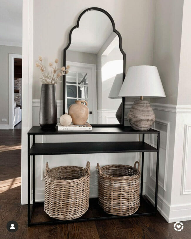
Lauren Ashley Hansen does a lovely job with this dark metal console table. If your table is in the entry or in a place that will reflect something interesting, a mirror is nice for the focal point. The focal point should be the largest and tallest piece above the table. Does this look balanced to you? It is! The lamp is about the same height as the vase of flowers. It’s also balanced because the base of the lamp carries quite a profile. It’s got a fat bottom. You’ll want to give the opposite side the same visual presence. I also like that the light tan color moves your eye from the left to the right then down to the baskets. Almost like a “Z”. Very nice.
 Angela Wheeler Design
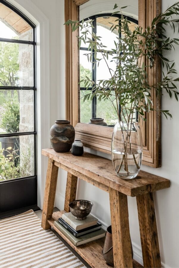
Look at this gorgeous entry by Angela Wheeler Design. This space is rustic yet elegant. It’s simple but the way it mimics what you see just outside the door is fantastic. It does that with the clear glass vase (like the door) and tall stems (like the trees). The color and thickness of the mirror is perfect too. Just imagine if the mirror only had a 1 or 2 inch frame. The entire space would not have the same impact. Angela also used the same colors throughout the vignette – the rug, table, books, mirror and pots. Very soothing.
 Lovely Etc. Blog
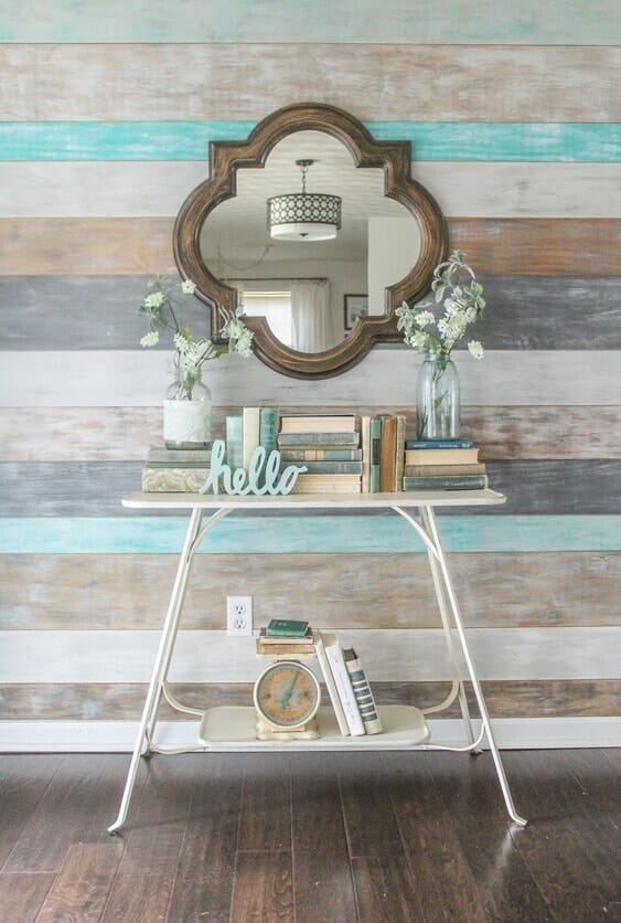
Lovely Etc. has a charming vintage console table. It’s so happy! If you like tables more full than sparse, this is how you do it. Because the table top and legs are thin, it’s best to have chunkier decor pieces on it. I love how the books coordinate with the wall colors and how the books are not all standing or facing the same way. Carrie used the books to add height to the small jars with flowers and to add symmetry at the same time. That same vintage charm runs beneath and uses the same color palette and subject matter (books) as the top. Clever!
 Liz Marie Blog
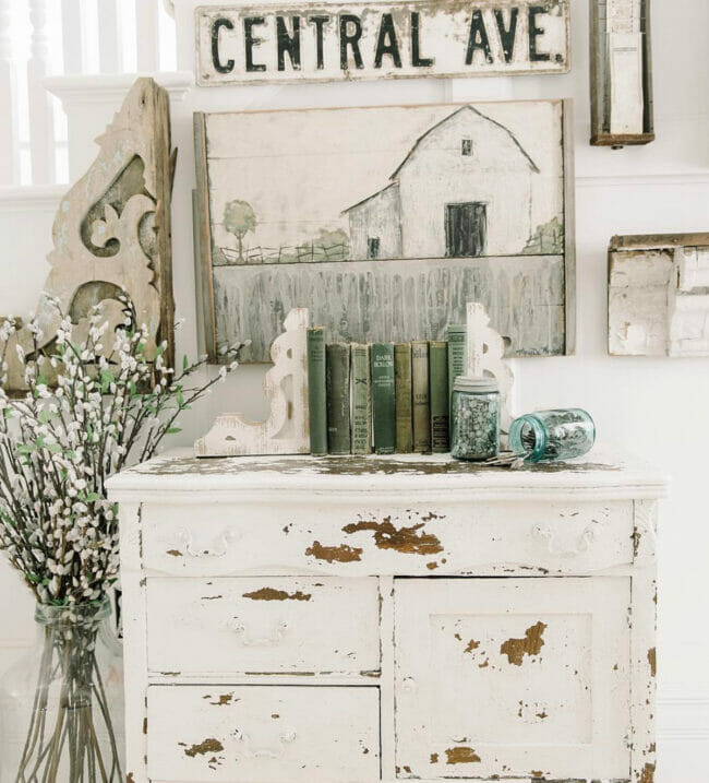
Liz Marie used a vintage chippy cabinet as a console table. And look – there’s no mirror! I love this photo because Liz Marie shows us we don’t have to use one thing on the wall behind the table. She has an entire collage of treasures – architectural salvage, a sign, a barn print etc. The top works because her books and bookends are lined up right in the middle and they coordinate with the colors in the painting. The added blue jars are whimsical and add a little more character. Not that it’s needed. This space would also look great without the tall floor vase of floral stems. It’s proportions would let it stand on it’s own. But that’s Liz, full of character and whimsy.
 Overstock.com
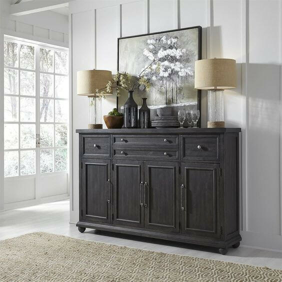
Depending on where your console table is located, you can use other items that are more functional and not just decorative. Notice how the print not only forms a triangle with the lamps but when looking at the print, your eye goes straight to the flowers in the vase. Then the vase causes you to notice the two lampshades. Then your eye peruses over the rest of the color coordinated table top because nothing stands out on its own. If you were to have a red vase tucked in there somewhere, that’s all you’d really notice. Not the idea unless that’s what you’re going for.
When styling your console tables, check for these things.
- Balance – Things don’t have to be symmetrical. Remember the first photo? The wide lamp base is about the same size as the grouping on the opposite side.
- Height – You don’t want everything to be the same height across the table top. Vary the heights. Trust me, it just looks better.
- Shape – After choosing what you want on your table, step back and check to see if you have created a visual triangle. It doesn’t have to be an equilateral triangle. It can be isosceles or scalene as well.
- Color – You don’t need to have everything match but it looks more put together with some coordination.
- Character. Add a bit of cuteness, quirkiness or YOU to every table vignette.
Here are some other accessory ideas that will add style to your console table.
- The obvious vase with or without flowers but greenery, flowers or stems bring tables to life.
- Lanterns, lamps or candles
- Table top clocks, statues or urns
- Plants, pots or decorative balls, spheres or orbs
- Layered prints instead of one large focal point
- Family photos (large enough to see from across the room)
- Architectural pieces, antique treasures or unique junk found on the side of the road

Great post! Thanks for explaining how to create balance.
Author
My pleasure. Happy Decorating Elle!
I love this new series Cindy! I love the diverse selection of console tables you chose this week – they’re all stunning!
Author
Thank you Michelle. I thought so too. Enjoy your weekend and get on that spring cleaning!
Well, I am definitely WOW-ed! These posts are amazing and I am learning so much. You might want to think about gathering them all together in a coffee table book. I would buy that for sure. Can’t wait til next weekend.
*Smiles*
Author
You are so sweet Pamela, thank you. I’m so excited it’s helping and exciting readers. Have a great weekend!
Thanks, pinned it, have a great weekend it’s cold and cloudy here.
Author
It’s so yucky here. Drizzling and cold ALL WEEK! I need sunshine! Stay warm Marlene!
Great post. I don’t have a console table–or a space for one but I really enjoyed reading your post!
Author
That means a lot – especially if you don’t even need to read it! Thank you Kathy!
Great options for all kinds and sizes of homes. Your console collection is lovely, and thanks for sharing!
Author
Thanks bunches Julie!
Love this new series SO much, Cindy! I swear I learn something practical I can use immediately in my home with each and every post. I’ve been toying with the idea of replacing the bench in our entry with a slender table so I definitely appreciate the inspiration. It’s so helpful! Keep up the good work lady! Hugs, CoCo
Author
Awe, thank you. Glad you like it. And I know whatever you choose for the entry will be perfect. I do love that bench though. Super cute! Thanks for popping in. Happy Monday!
This post couldn’t have come at a better time! Our console table has been empty since I took down Christmas decor because I just couldn’t decide how to decorate it. You’ve given me so much inspiration now! Thank you!
Author
Awe, that makes my day Christine, thank you. So glad I could help. You’ll have to think of me each time you pass the table! LOL!
Cindy, I pinned the Angela W design about a month ago. This rustic but refined look is what I’m shooting for in my own décor, but with the rustic being more of like 15%.
I found a beautiful wall rack in December. It’s made out of salvaged wood, and has been hand carved. It’s pieces like these that keep refined décor from being stuffy.
Thanks for adding this great post, and talking us through the finder points of good designs practices!
Author
I love a refined rustic look. I am in the process of trying to change things around in our home. Keep all the farmhouse stuff at the farmhouse and keep our home more casual “pottery barn” look. Will take a while but be fun! I bet the wall rack is beautiful! Since having to chop down two 300 year old oaks, I’m trying to find ways to use the wood. My first project will be a live edge side table for the living room. Fingers crossed. We are not wood workers around here. 😉 Thanks for the visit Rachelle!