Hello Sweet Friends! Well it’s June, it’s hot and I’m ready for a mantel change. How about you? I’m going to concentrate on the mantel in the family room in our home in Highland Village today. I’ve griped about its dinkiness before. I like the stone but the mantel is so shallow and uneven it’s hard to put much up there. So I thought I’d change it up three different ways and see what I like best. Yep, I said one mantel, three different looks. 😉
One Mantel, Three Different Looks
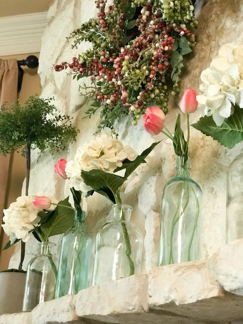
It’s hard to decide right away what I’m going to like best so I begin by gathering my decor staples; the items I typically use because I enjoy looking at them. Bottles, flowers, greenery, something vintage and some sort of wreath. I rarely tire of those little cuties.
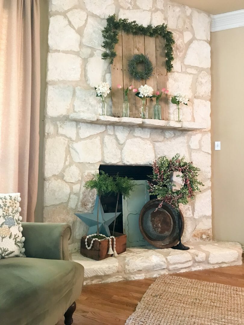
Mantel Look #1: Pros and Cons
Pro – it’s got just about everything under the sun I like looking at. Vintage goodies, rusty stuff, flowers, greenery, bottles, etc.
Con – it’s hideous. Okay, maybe not that bad but I was thinking, since we aren’t going to use the fireplace for another 6 months, maybe I could cover it up. Not the best idea I’ve had. Con #2, the piece on top looks like puny Christmas garland. It’s too short and the wreath isn’t the right size either. Con #3, the focal point should either be the top mantel or the entire fireplace. Not so heavy on the bottom that that is what you notice first.
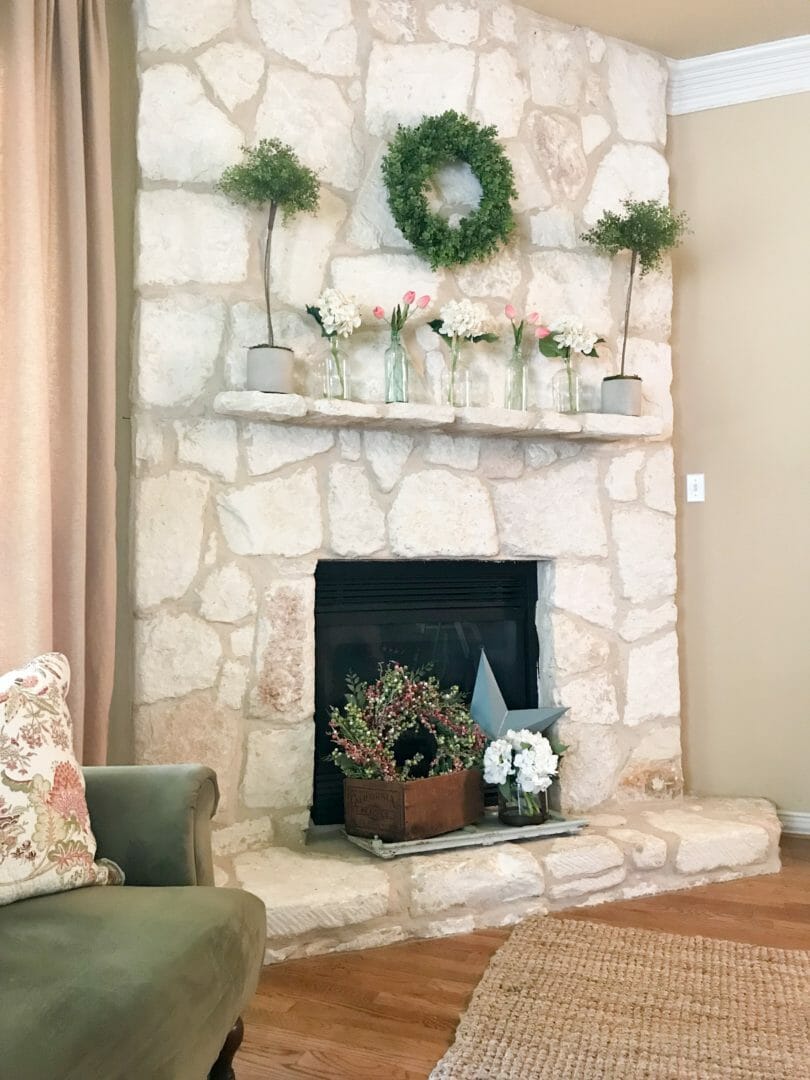
Mantel Look #2: Pros and Cons
Pro – I like the top better for sure. It has better scale and cohesiveness.
Con – Covering up the bottom still looks a bit off to me. It’s not as full looking but still not that great. I could continue working with it but instead I’m going back to the usual… creating a large triangle from top to bottom.
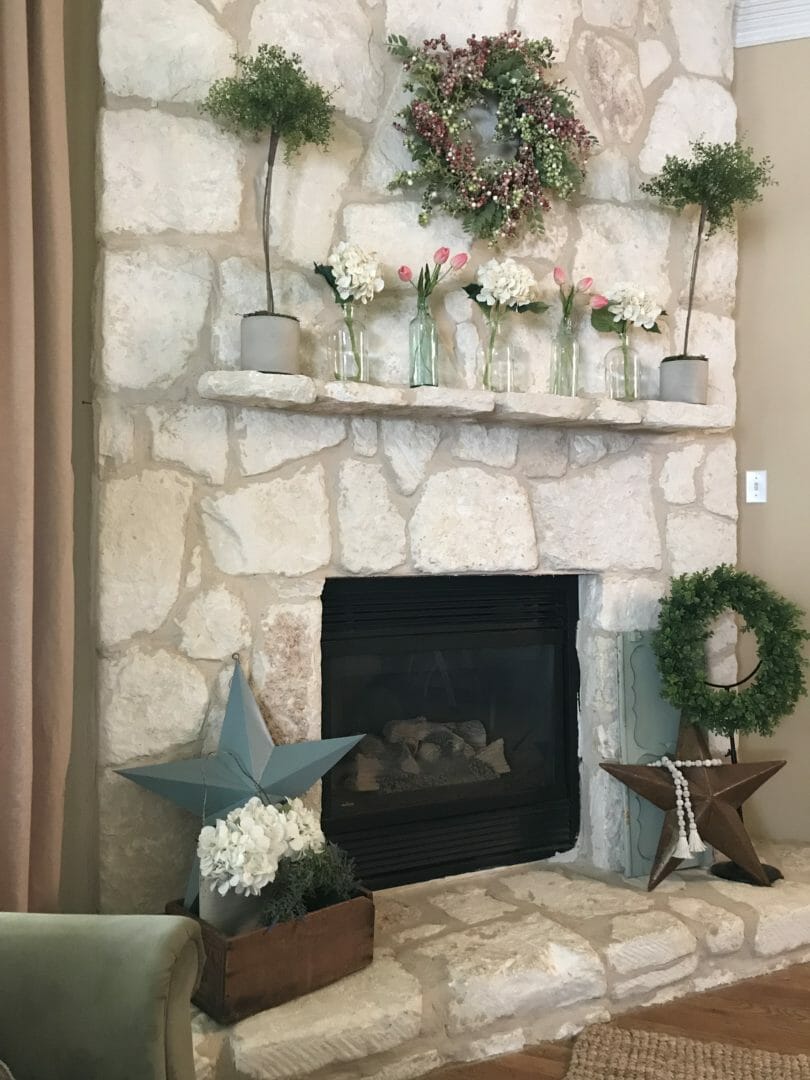
Mantel Look #3: Pros and Cons
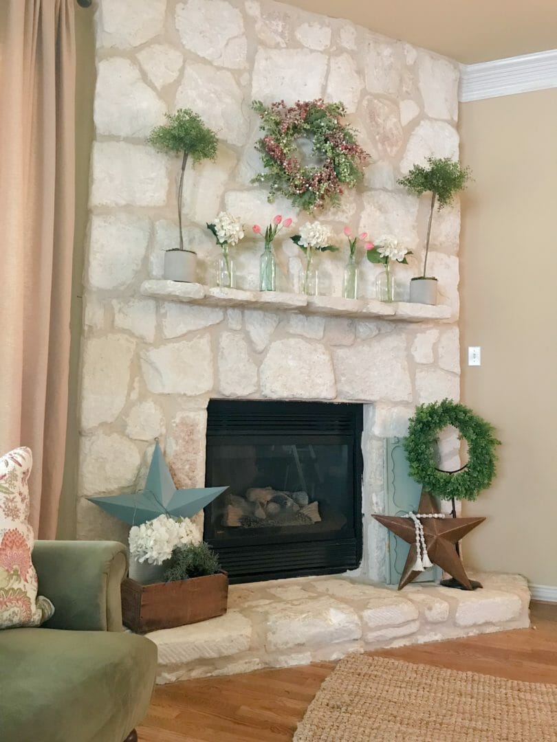
Pro – This one is my favorite look. I like the top with the pink and green wreath, the bottles with flowers and the adorable topiaries I made. If you want the topiary DIY, click here.
Pro #2 – I like how the bottles work with the color at the bottom and there is pink in the flowers and in the wreath.

Pro #3 – The topiaries add enough green and height to the mantel without being overwhelming or to squatty. They’re just right.
Pro #4 – Since the accessories are spread out, it doesn’t look bottom heavy. Your eye moves around the entire mantel in a triangle.
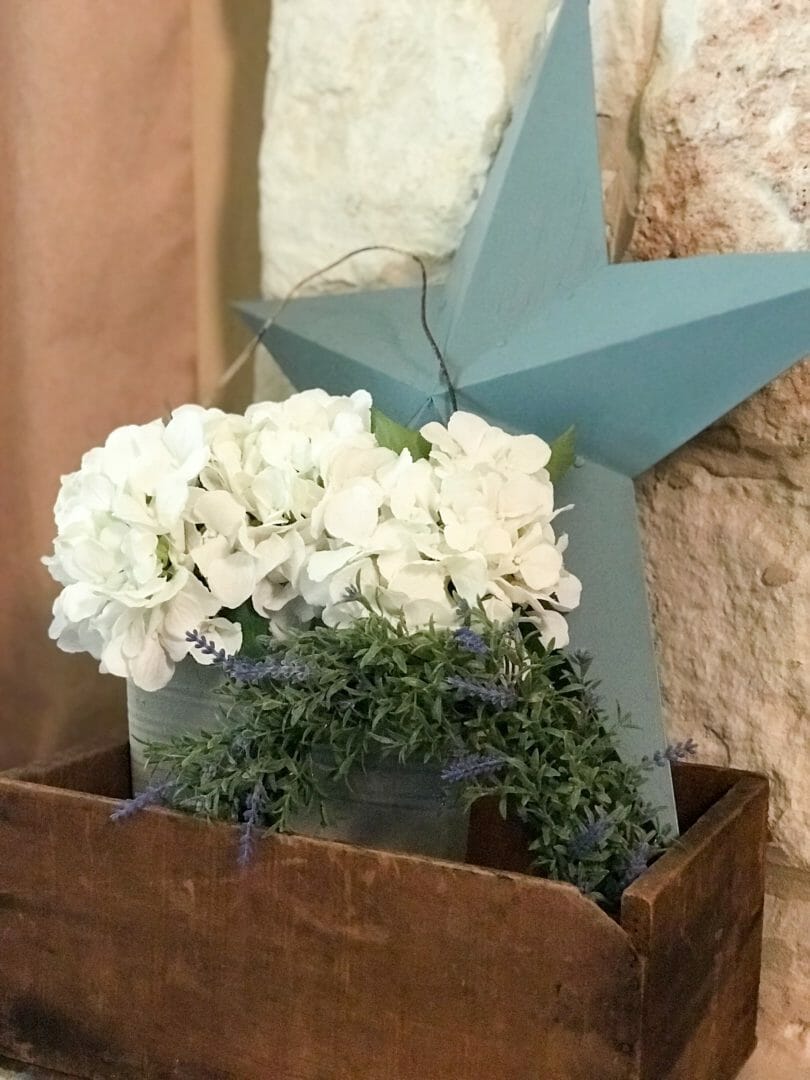
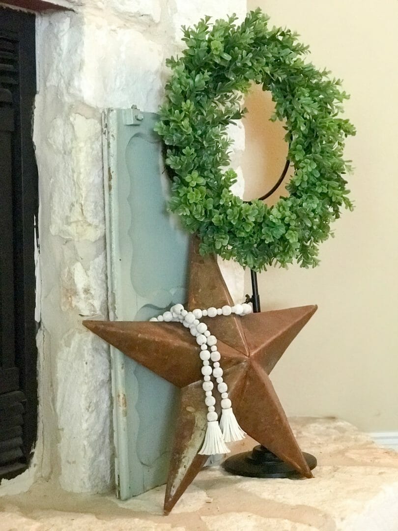
Pro #5 – The brown vintage crate with the pale blue star, white flowers and small green wreath coordinate with the other side and the pale vintage door, rusty star. white beads and greenery.
Now you’ve seen a little bit of how I think (go crazy) when trying to decorate this dinky stone mantel. Sometimes I get a wild hair that doesn’t work out. Sometimes after 2 hours and lots of stepping away and coming back, I finally find happy ground. 🙂
Total side note – That last post, the Perfect Vignette in 3 Easy Steps… It was my 100th post! Thanks for sticking around and making this so fun! I mean it. From the bottom of my heart, you mean the world to me! XXOO

I like #2 the best.
Author
Thank you Florence! I love change so who knows what it will look like in a week or two. 😉 Have a great week!
Gorgeous!!! Try … Try .. Again!! That’s my motto… I step back .. change something.. step back… (I have been known to send a picture from my phone to my sister!! Help !!! lolololol) I love the way the mantle co-ordinates with the chair and pillow !! Perfect Spring & Summer colors
Author
Well thank heavens I’m not the only one! LOL. Sometimes it takes an entire day! My husband just walks through the room and gets a look on his face but doesn’t say anything. He’s smart that way. HA!
Decorating truly is a process. You made me laugh at “It looks like a puny garland”. I still struggle with my ginormous fireplace. Love the touches of pink and green. It feels fresh.
Author
I know, right?! Sometimes it comes super easy and quick. Other times it’s ridiculous. I’ve never been stumped completely but this fireplace gives me fits! Hope you have a great week!
I have another suggestion. I like the third one, but put the boards back up behind the big wreath and take away the topiaries.
Author
Wish I could Karen. I’ve tried that but the board takes up a lot of the mantel space since it’s so shallow and with a larger wreath it falls forward. I wanted the bottles up there but it needed a larger wreath and the board will not accommodate that look. Thanks for the suggestion though. Great idea! 🙂
Hello from the Texas Gulf Coast! I love your home and your decorating style! I particularly enjoyed this post as it shows not just the final result but also numerous other try’s that just didn’t quite work. Look forward to more beautiful ideas!!
Author
Gwen! Where do you live?! Did you see Galveston when the water was so blue? I couldn’t believe it! Wish it were always like that.
Thank you for your kind words. It means a lot and I’ll keep trying! 🙂
the final one has me swooning all over MY mantel…love it
Author
Awe, thank you BJ. You made me smile. 🙂
You called your fireplace dinky at the end of your post, and the whole time I was admiring and envious of the beautiful sandstone color of the rocks! Mine is an outdated brick fireplace…
Author
Lol. Yes I think it’s dinky. I can’t put frames up there or really anything deeper than my hand. 😏. Have you thought about painting the brick? I did that in our old house and it was fantabulous!!!
I do like the last one the best, you are very good. I do mine and it takes me a couple of months to get it right. I can look and look and not necessarily like it but can’t decide why, but finally i think of something else that might look better, but i am slow. Congratulations!
Author
Thanks Marlene. Sometimes I’m more picky than others. But I’ve stared at a shelf in our family room for months and fooled with it until I want to rip it off the wall so I understand. I have two side tables now that are getting on my last nerve.
I love #3! So very pretty…. I would love to change my mantle up. It’s just so hard to since I have the most challenging mantel ever! lol However, you have inspired me as yours is so beautiful!
Author
I thought I had the most challenging mantel ever! Glad you are inspired. 😀 Send me a pic when you’re finished!!!
Your fireplace is absolutely outstanding! What a gorgeous focal point…no matter how it’s dressed! Beautiful.
Author
Thank you Kim! It’s a struggle most times so that sweet compliment means a lot. Enjoy your summer!
Thanks so much for stopping by!! I LOVE all the looks and would probably end up using all of them over time!!
Hugs,
Debbie
Author
No Debbie, thank you! Hope you have a great week! 🙂