Hey there friends! Remember last fall when I showed you Fall Color Combinations to help with decorating? Today I’m showing spring! If you are wondering why I didn’t have one for winter, it’s because I just plain forgot. I totally should have because then maybe our winter months would be a little less gloomy but hey, at least I remembered to do it this time, right?! So here are five spring color combinations to help this season.
Five Spring Color Combinations
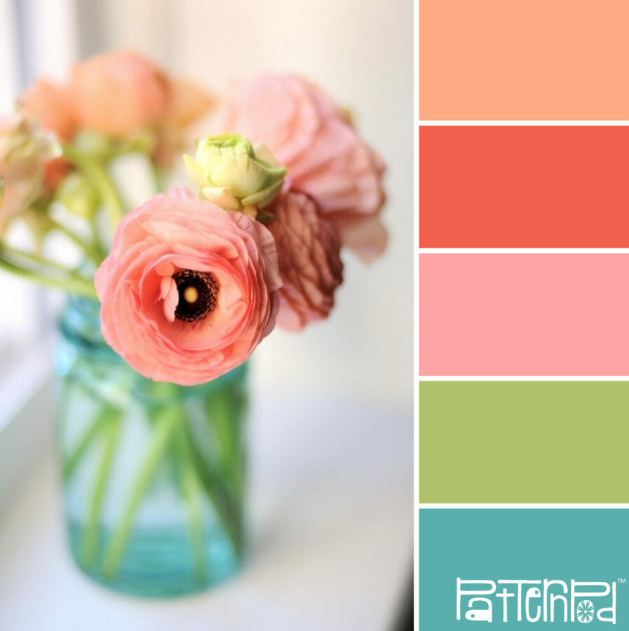
Hello Spring! This one from Fox Home Decor DIY is my kind of inspiration! Who wouldn’t smile walking into a room filled with these happy colors? I have a collection of blue mason jars so I think adding pinky blush and peach would make me dance all the way to the family room and back again.
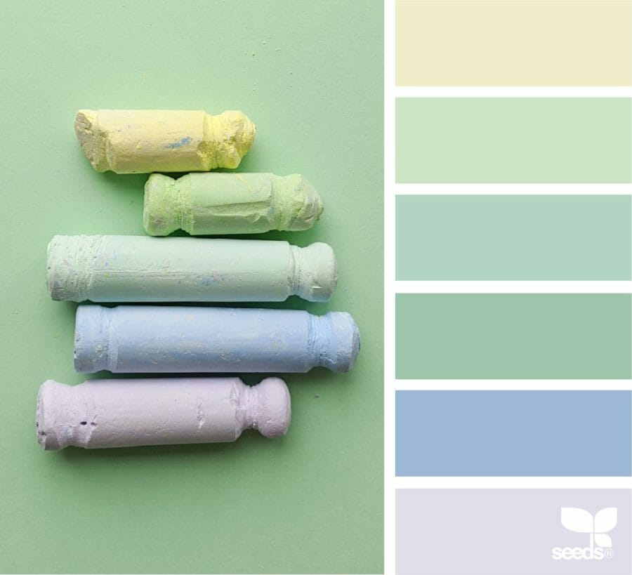
If you are more into pastels, look at these soft sweet colors put together by Design-Seeds. I can see a room with the lavender and ultra pale gold together. Those two in whatever form along with green plants would be magnificent together! They don’t remind me of baby nursery colors at all either. I think it’s the different greens in the middle. From Easter eggs and dresses to bouquets and hats, this is one beautiful combination.
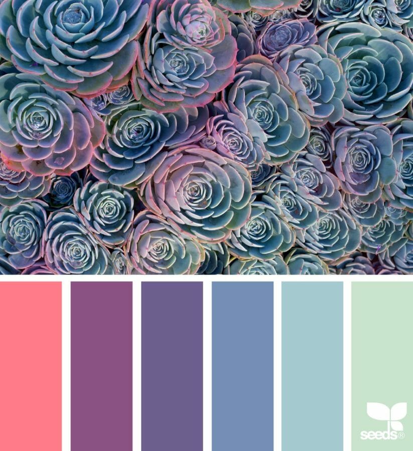
Who likes the bright but deeper tones? Check these out by Design-Seeds. Coral is one of my favorite colors for spring and summer use. A lot of people might put coral and yellow together or coral and navy. But what about the light pistachio or purple with it? That would be a stunning combination rich in bright bliss.

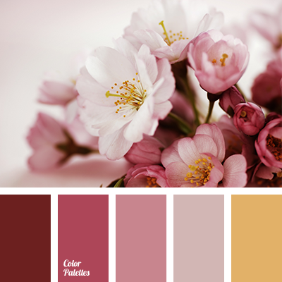
You probably know by now that my favorite color is pink. All kinds of pink. So when this one popped up by Color Palettes, my brain went berserk with ideas. I never thought to put two different colors of pink together at one time but I feel it would make quite the statement. Almost like wearing a pink blouse with pink lipstick. Well of course! It goes together like rama lama lama ka dinga da dinga dong!
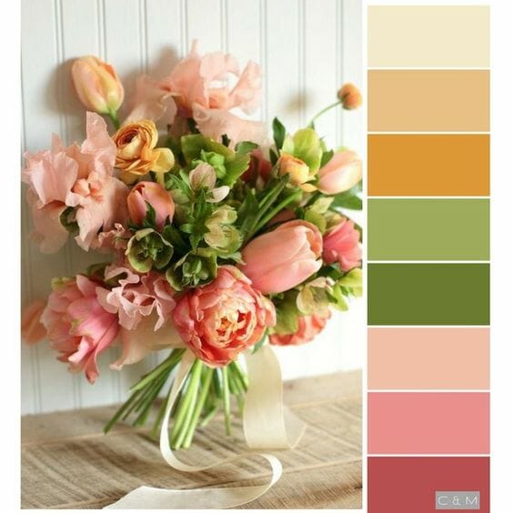
I’ve heard designers say this year a few trendy colors in home design will be olive greens, mango and earthy gold colors. Well we need a different variation of that for spring. This combination by Color Palettes will brighten up those popular colors quite a bit. I’d be happy with these.
Bonus – Spring Color Combo
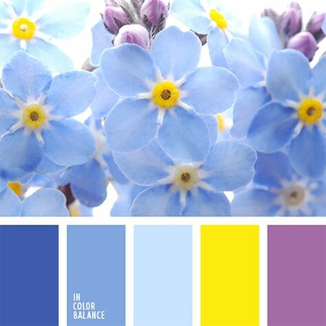
For anyone using Pantone’s color of the year, Classic Blue, in their home decor, here’s a color combination by Zonamasak.ru that can take you all the way into summer. I’ll be honest, it’s not my favorite combo and you should be careful with this one. In my mind it’s like sitting by the ocean watching the old guys walk by in their yellow Hawaiian shirts and purple shorts. That’s not a good look. But that’s just my 2 cents. I do like the lemon with blue though. That is a happy-go-lucky spring look.
Okie doke, there are Five Spring Color Combinations to help us all with our spring decor looks this coming season. I already have a favorite. Which one is yours?
Happy Decorating Friends!
If you’d like to follow my Pinterest Page, click here. It’s full of beautiful Spring and Summer decorating ideas!

Great ideas for upcoming spring decor Cindy. Love the color combinations. Pinned to my Home Decor Colors Board.
Author
Glad you like them Carol. And thanks for the Pin! Hope you enjoy our next 2 days of sunshine!
Hi Cindy,
Love these boards. I’m a pink lover too. All different variations of pinks works great together. I always plan to try various things but sometimes honestly I get lazy.
I try to embrace faux flowers but I rarely fall in love with them and that may be why.
Enjoy your weekend!
Author
Part of my problem is laziness too. Not wanting to get out and hunt for what. And as crazy as it sounds, I don’t like to spend money. Glad you like the boards. Thanks!
It’s hard to pick either #4 or#5. I have a lot of blue in my house but that’s sort of my neutral so for different seasons i like to bring in other colors, i love pinks and a little yellow for spring. I love these color combinations you do, it kept me focused for Fall so keep up this idea, you are a big help for my scattered brain,lol!!!
Author
I’m so glad it helped you stay focused Marlene. It did me as well. When I’d look at something new last fall, I would remember, my inspiration photo to keep me on track. Last year I added pink at the farmhouse and kept it blue here in Highland Village. Still not sure what I’m doing yet. But I better make up my mind soon! It’s just around the corner – at least for us in Texas. 😉
Well, the first and last ones are right up my alley . Can’t wait to see how you use your favorites. Thanks, Cindy you’re always on point with your advice.
Author
Thank you. But did you read the paragraph before the last choice? Does it sound like you? LOL!
Still pretty a year later! Thanks to Julie from My Wee Abode for sending me over here to your blog!
Author
Welcome Peggy. Julie is a sweetheart! I’ll make sure and thank her. Hope you have a wonderful weekend.
I love your color palette posts! The one I did for my bathroom is still one of my best pins on Pinterest! I’m happy to be featuring you at Tuesday Turn About this week! Pinned!
Author
Aww. thanks so much. I never thought they’d be so popular but wowza. Appreciate you. Hugs.